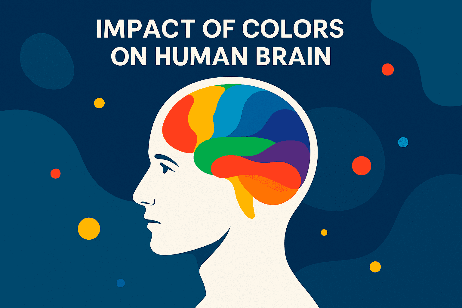
On the color wheel, Color theory is a tool that organizes colors in a circle, describing the relationships between primary colors (red, blue, yellow), secondary colors (green, orange, purple), and tertiary colors. These combinations not only shape aesthetics but also influence how we feel and respond, a concept explored in color psychology. For example, warm colors like red, orange, and yellow are often associated with energy, warmth, and excitement. In contrast, more incredible colors like blue, green, and purple are typically linked to calmness, tranquility, and professionalism.
Also read: What Is Gaia Space Telescope & Why Was It Tragically Shut Down?
Contents
- 1 🧠How Color Psychology Shapes What We Feel, Do, and Choose
- 2 ❤️ Red: Excitement, Urgency, Passion, and Action
- 3 💙 Blue: Calmness, Trust, Reliability, and Security
- 4 💛 Yellow: Optimism, Happiness, Attention, and Caution
- 5 💚 Green: Growth, Balance, Harmony, and Calm
- 6 🧡 Orange: Enthusiasm, Confidence, and Adventure
- 7 💜 Purple: Luxury, Creativity, and Mystery
- 8 🩷 Pink: Femininity, Comfort, and Softness
- 9 🖤 Black: Power, Elegance, and Mystery
- 10 🤍 White: Purity, Simplicity, and Clarity
- 11 🩶 Gray: Neutrality, Balance, and Detachment
- 12 Conclusion
🧠How Color Psychology Shapes What We Feel, Do, and Choose
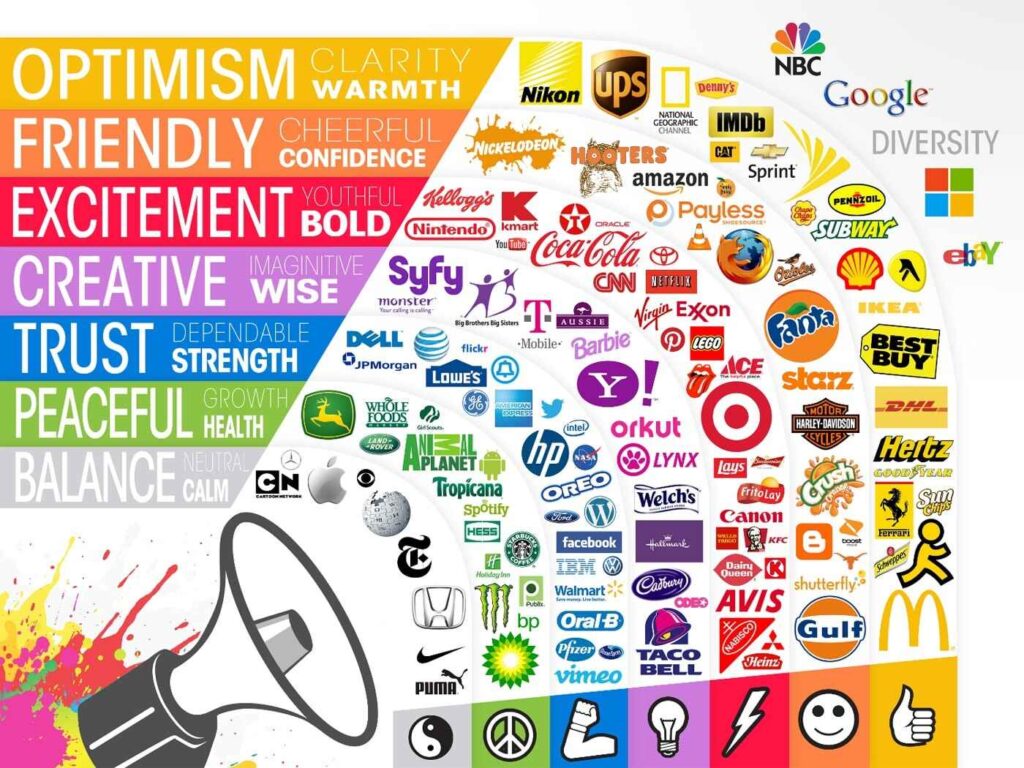
Understanding the psychological effects of colors allows businesses, designers, and individuals to strategically choose colors that will resonate with their audience, enhance experiences, and evoke the desired emotional response. Whether it’s promoting trust with blue or creating urgency with red, the color psychology plays a critical role in shaping human behavior.
The choices of colors have vast implications in various fields. In marketing and advertising, colors are strategically chosen to appeal to consumers’ emotions and drive behavior. For instance, fast-food chains often use red and yellow to stimulate appetite and excitement, while tech companies may use blue to promote trust and dependability.
In design, understanding color psychology allows artists and designers to create visually harmonious compositions that resonate with the viewer on a subconscious level. The right choice of colors can make a brand feel more relatable or evoke specific actions from its audience.
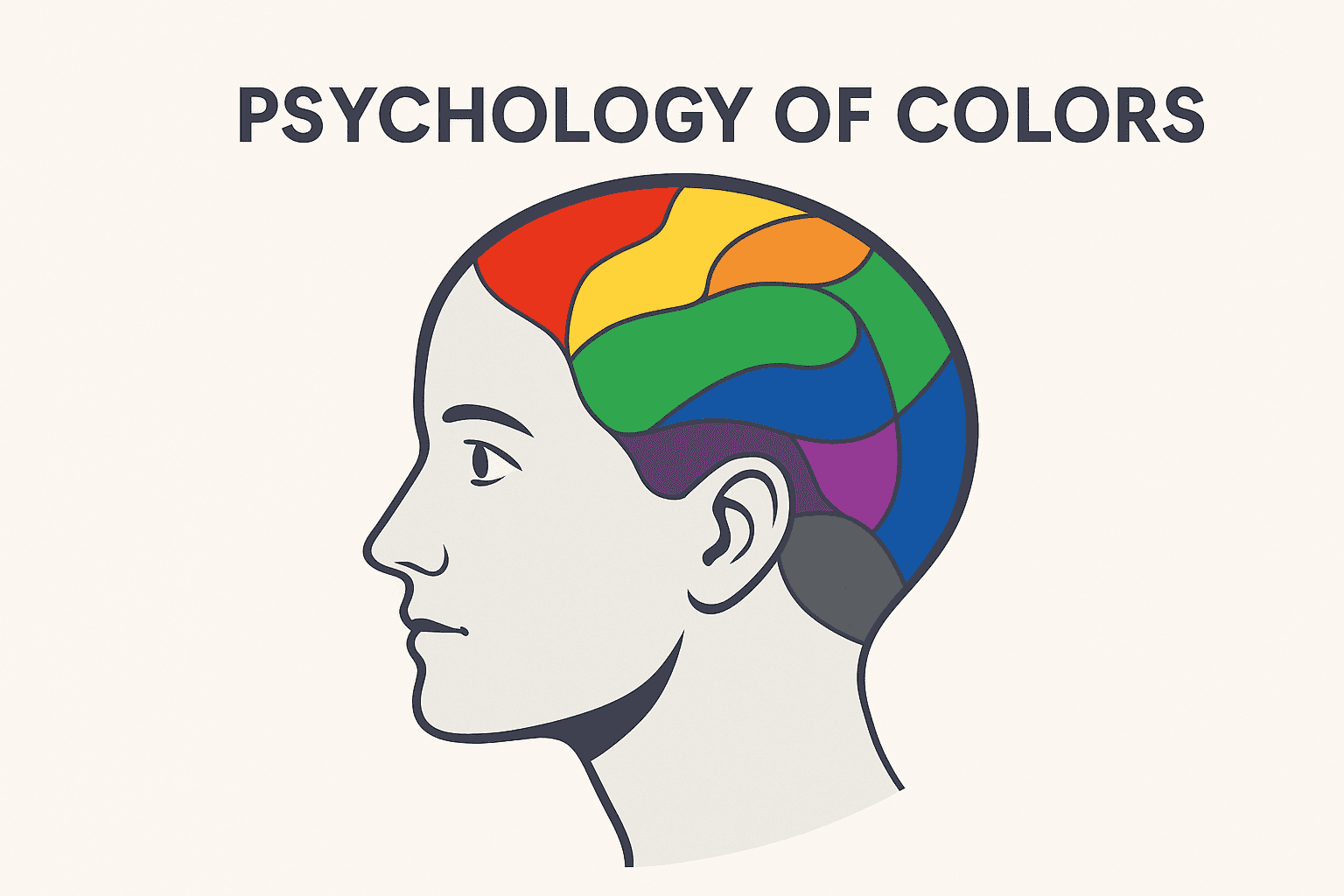
Colors have a profound impact on human emotions and behaviors. Here are some of the common psychological effects associated with certain colors:
❤️ Red: Excitement, Urgency, Passion, and Action
Psychological Effects: Red is one of the most intense and attention-grabbing colors. It is often associated with strong emotions like passion, love, anger, and energy. It can evoke a sense of urgency or heightened alertness.
Common Associations: Excitement, action, energy, love, and aggression.
Effect on Behavior: Red stimulates the heart rate and can increase blood pressure, which is why it’s commonly used in fast-food restaurants and clearance sales to prompt quick decisions. It’s also used to grab attention, especially in warnings or emergency signals.
💙 Blue: Calmness, Trust, Reliability, and Security
Psychological Effects: Blue has a calming effect on the mind. It is often linked to feelings of tranquility, stability, and trust. It is known to lower heart rates and reduce stress, promoting a sense of peace.
Common Associations: Trust, serenity, loyalty, professionalism, and coolness.
Effect on Behavior: Blue is frequently used in corporate settings, healthcare, and technology brands because it encourages calm, logical thinking and is often perceived as trustworthy and reliable. It promotes thoughtful decision-making and careful consideration.
💛 Yellow: Optimism, Happiness, Attention, and Caution
Psychological Effects: Yellow is bright and energizing, often linked to happiness, warmth, and positivity. It’s a stimulating color that can evoke feelings of optimism and creativity.
Common Associations: Sunshine, happiness, energy, and caution.
Effect on Behavior: While yellow encourages creativity and optimism, it can also cause anxiety if overused due to its intense vibrancy. It’s commonly used to grab attention and highlight important information, like in warning signs or sales advertisements. In excess, yellow can lead to irritation or restlessness.
💚 Green: Growth, Balance, Harmony, and Calm
Psychological Effects: Green is associated with nature and growth. It symbolizes balance, renewal, and harmony. It is a calming color that is often used to invoke feelings of relaxation and stability.
Common Associations: Nature, health, freshness, and tranquility.
Effect on Behavior: Green can soothe the mind and promote a sense of well-being, making it a popular color in healthcare, wellness, and environmental branding. It also represents sustainability and eco-friendliness, which influences decisions related to health and environmentally conscious purchases.
🧡 Orange: Enthusiasm, Confidence, and Adventure
Psychological Effects: Orange is a stimulating and vibrant color that combines the energy of red with the optimism of yellow. It promotes feelings of enthusiasm, confidence, and warmth.
Common Associations: Adventure, fun, confidence, and creativity.
Effect on Behavior: Orange can increase excitement and energy, making it a good choice for calls to action or products targeting younger or active consumers. It’s often used in promotions to encourage quick decisions and spur creativity, though excessive use can be overwhelming.
💜 Purple: Luxury, Creativity, and Mystery
Psychological Effects: Purple is a rich and luxurious color often linked to royalty, wealth, and sophistication. It also has a creative, imaginative aspect and can evoke a sense of mystery or spirituality.
Common Associations: Royalty, luxury, spirituality, and creativity.
Effect on Behavior: Purple is used to promote high-end products and services, suggesting exclusivity and elegance. It is also used in creative industries to inspire innovation and original thinking. Purple can encourage thoughtful decisions, especially when it relates to artistic or high-status products.
🩷 Pink: Femininity, Comfort, and Softness
Psychological Effects: Pink is often seen as nurturing, calming, and soft. It is closely associated with femininity, love, and tenderness.
Common Associations: Love, kindness, nurturing, and softness.
Effect on Behavior: Pink has a calming, comforting effect and is used to promote warmth and affection. It’s commonly used in products for women and in spaces that are meant to feel cozy or inviting. Too much pink, however, may evoke passivity or infantilism.
🖤 Black: Power, Elegance, and Mystery
Psychological Effects: Black is often seen as a color of sophistication, elegance, and authority. It symbolizes power, control, and mystery, and it can evoke feelings of drama or solemnity.
Common Associations: Power, luxury, sophistication, mystery, and death.
Effect on Behavior: Black is often used in luxury branding and high-end fashion due to its association with wealth and status. It can create a sense of exclusivity and importance. However, it can also be perceived as negative or oppressive if overused, especially in spaces or contexts that require light and openness.
🤍 White: Purity, Simplicity, and Clarity
Psychological Effects: White represents cleanliness, purity, and simplicity. It is often used to convey freshness and clarity, evoking a sense of neutrality and space.
Common Associations: Purity, simplicity, cleanliness, and innocence.
Effect on Behavior: White encourages clear thinking and is often used in minimalist design to promote focus. It’s commonly used in healthcare to create a sense of sterility and safety and in marketing to communicate simplicity and transparency. However, too much white can sometimes feel sterile or cold.
🩶 Gray: Neutrality, Balance, and Detachment
Psychological Effects: Gray is a neutral color that can evoke feelings of balance, stability, and detachment. It is often seen as conservative and practical, but can also feel dull or uninspiring.
Common Associations: Neutrality, professionalism, sophistication, and indecision.
Effect on Behavior: Gray is often used in professional environments, as it conveys neutrality and seriousness. It can create a calm and stable environment, but may also evoke feelings of boredom or depression if overused. It’s best used as a complementary color to balance out more vibrant tones.
Conclusion
Colors are not just visually stimulating, they also have a profound psychological impact on how we think, feel, and behave. Different colors evoke specific emotional responses, and understanding these associations is key in fields like marketing, branding, design, and even therapy.
Ultimately, color theory or color psychology is not just an aesthetic tool; it’s a powerful instrument that shapes human perception, influences emotions, and drives behavior across multiple domains of life.
The process by which color is chosen and utilized in day-to-day life has a profound effect on the choices of an individual.